Oasis Domestic Abuse Service support people affected by abuse across Kent and the South East and have done for over 25 years. They contracted me to improve accessibility and user journeys on their current Squarespace website.
Over several months we’ve defined a new IA, revised persona set, and revisited some fundamental parts of key persona journeys to surface important content earlier in the journey to the right users.
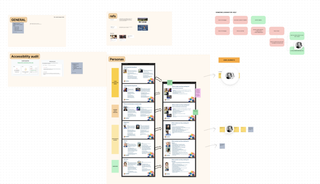
After mapping out personas with BBComms I carried out a mini UX/UI review of the current site, brand and UI application, and the overall user journey through the content. Key things were defined in a report and presented to the board at Oasis.
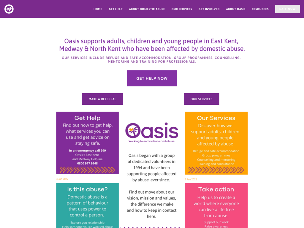
All approved the changes and suggested next steps. An excerpt of this report from the Homepage section :
Homepage (summary)
Overall the homepage lacks sensible structure and cohesive layout. It’s very boxy, with a lack of emotional connection to the user needs given the context. It also has a number of accessibility failings and user interface needs. A couple of these noted in their report:
- Get Help Now – isn’t actually getting help now but is the most prominent button.
- Exit now should be clearer – it currently fails accessibility colour contrast and you can hardly see it
- CAPITAL copy in a sentence fails accessibility as screen readers cannot see it as a sentence – labels are ok in caps, sentences should be sentence case
- The 3 circle graphics are links (I didn’t know until testing and trying to click them!)
All hyperlinks should be :
– clearly labelled
– clearly have an active and hover state
Accessibility issues
I also ran an accessibility test with a couple of online WCAG aligned tools. This surfaced some of the following issues…
- Squarespace cookie banner – no ARIA label for closing it
- Button hover states – there are none or are not clear enough
- Capitalised copy in content /body text
- Hierarchy of headings on pages
- Meta data and descriptions to be added on all content that requires it (namely media files)
- Links to other pages or content without labels or clear CTA
- Speed of site is slow in some areas
- Lack of accessible code in some pages for keyboard accessibility
- Far too many elements have low or zero contrast between them
- Confusing form fields to screen readers
- Lots of lists are not using the semantic code
- No accessibly supplied captions to videos
Moving forward
After some time exploring options for improvement with the Oasis board, we decided to redesign the site and start with a new fresh approach, due to be completed in 2023.