Admiral Insurance are one of the UK’s largest Insurance companies. I worked with them at Red Bullet acting as a UX Product Manager, driving the vision for better UX and increased conversion working with our designers.
THE CHALLENGE
Admiral came to my old agency with a tired, old long form system for taking quotes.
They were in the throws of technical architecture for their new quote engine and needed a new slick frictionless experience for their users to click through and complete quotes with greater ease.
THE SOLUTION
Initially working on the single car quote process, we moved through the different products over the course of 3 years with the Admiral team, pressing them and questioning them on the data models, data set and order of questions through the quote process.
I found the fact that they were rebuilding their system in tandem was a huge help for the ability to really affect change for better user experiences.
Assumptions & knowledge – leading the user
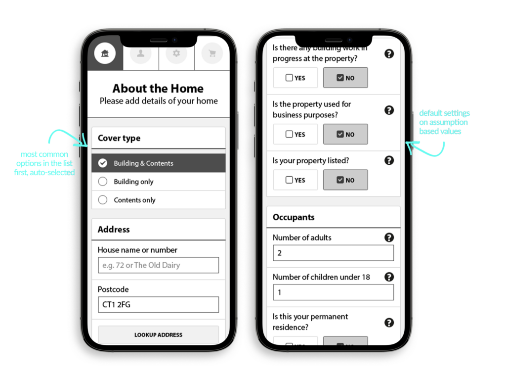
Working into the data that sat on the old forms, it was clear that the fields on the current form were all over the place and in big long lists, huge cognitive load for a user, so we reduced these into 4 sections, which framed all we took a user through:
- About the home
- About you
- Preferences (account details and marketing preferences)
- Price and purchase
fig.1 / We set common insurance defaults as the first on any list (eg – most people go for a quote for buildings and contents). Additionally, we knew that there were a series of questions that compliance and Admiral had to ask. These are almost always met with a ‘No’ answer – so we suggested for questions where it was informational to consider defaulting the selection to the most common answer (i.e. most people do not have building work going on in their home).
However. After user testing we decided against this approach for auto-fill. Whilst the mindset was correct, the reality is users miss things. And if the data is auto filled, we risked completing form data for a user where it was possibly incorrect – not an option in insurance!
So the UI layout and interaction stayed the same, but with a required selectable option on either button.
We defined an accordion style approach for showing helpful information for the user on request. Taking a lead from .gov design principles we led with ? icons on all form input elements, allowing the variation of user stories, needs and understanding to be met with helpfulness at all times.
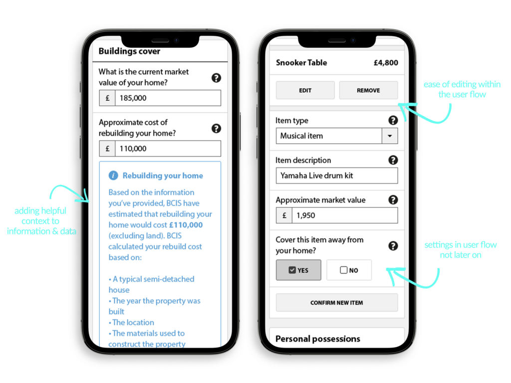
Additionally we ensured that the issues on the old form editing flow (you can’t edit individual data – on the the whole page) were mitigated by ‘in-journey’ editing – allowing users to simply reopen data items (fig.2 shows a snooker table itemised insured item) and then re-edit or even remove that item.
Further, I felt it made sense to allow specific items data and relationship to other parts of the form to be covered all in one screen, so allowing the user to choose both in home and out of home cover for specific items was new for Admiral in this flow, but made complete sense.
Previous forms and other competitors don’t allow the user to do ‘away from home’ itemised relationships until another screen as it related to a different calculation in the backend.
UX and UI crossover, of course they do. With the Admiral work, through the UX wireframe process there were elements of definition we settled on in spacing, UI hierarchy and list structures that were really elements of UI in the hi-fidelity wireframes. Working with the UI designers and visual brand application, they came to life more in the visual designs, but were very much defined in the wireframe and testing processes.
SUCCESS COMES IN NUMBERS
Whilst both we and Admiral internally did rounds of user testing and A/B tests on variants and incremental change through the design process, the overall success we wouldn’t know immediately as the product wouldn’t launch for another 2 years (!)
However, once it finally did, the soft launch of Home Insurance changes was first pushed to their sub smaller brands Elephant and Diamond, which saw overnight success, and within a month, the board was keen to push the new design to the main Admiral brand quote engine.
Within the first quarter Admiral saw over 40% increase in account application increases compared to the same data set from the old form. 📈
🎉 40%! A huge success, and one I am delighted to have been involved in 🎉
How might we help users self serve…?
Having worked on the leading product – Single Home cover – over the course of the next 3 years we worked on wireframes and UX for Multi cover Home, Single car, Multi car, and Multi-Product. We then built a frontend component library for their development team in Angular.js with a full brand switcher between Admiral, Elephant, Diamond and Bell.
Finally, after all the individual product flows, Admiral asked us to develop the wires for a client login system. I will write this up fully when I have time as a full case study, but here are some quick insights of the process I led the team through.
THE CHALLENGE
To create a space for users to access existing policies, and request upgrades, and change personal data and preferences
THE PROCESS
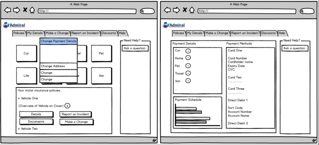
With the new system backend that Admiral were building to allow self serve, we were fed initial Balsamiq wireframes from their team to work from that showed the type of features that they were aiming to build in.
We spent some time workshopping out our ideas, researching competitors from the team’s own insurance logins, and defining questions, user stories, ‘what if’ statements and varying needs of different insurance policies.
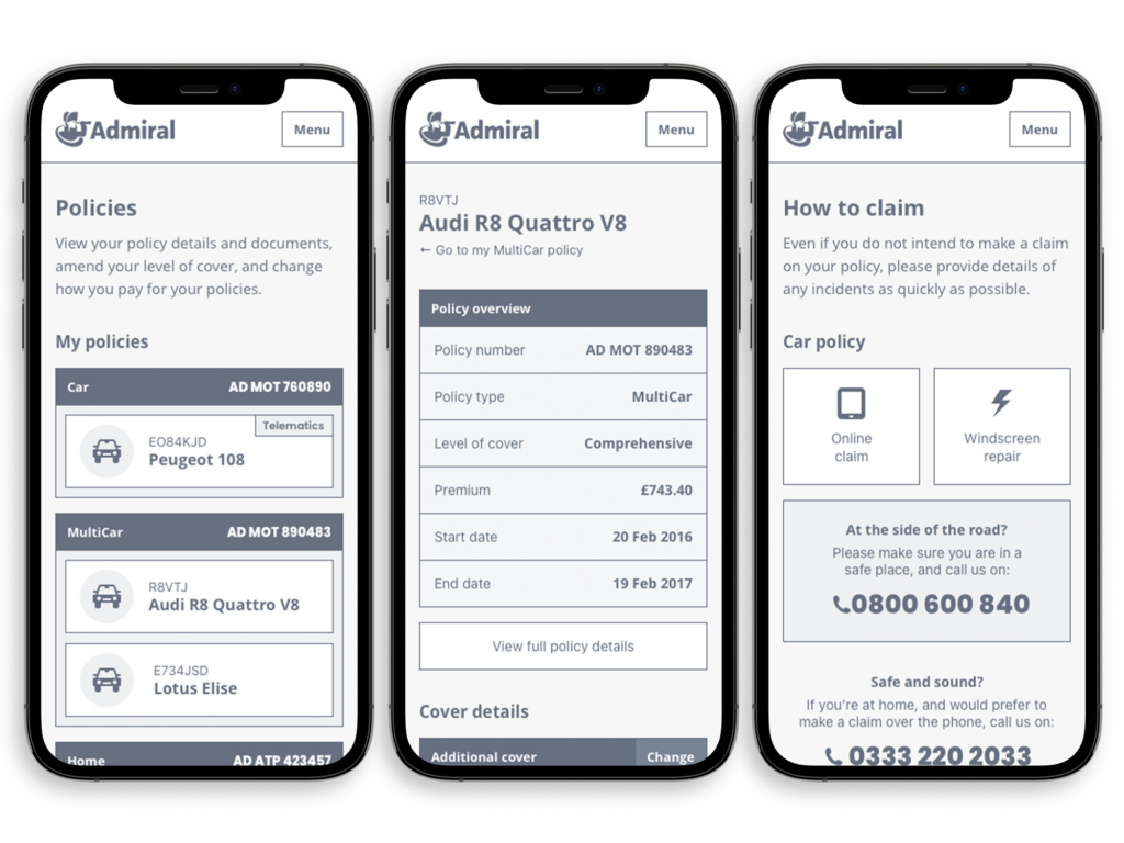
After many interviews, workshops and sketches we presented to Admiral the new wireframes structures for their site. As you can see as this is existing information, there are no sectioned steps like the quote process, but a navigation menu accessible from the burger nav in the top.
On small screens, we fixed the nav as a sticky nav so that users can always get to where they need with ease, as some of the screens could show a long scroll with all the data depending on how many policies a user had with Admiral.
As we had defined a design styleguide and component library in an earlier project, the hi-fidelity wireframes went to developers to work from rather than branded designs, and we finessed the experience in the browser over the following months.