ASUS are one of the world’s leading technology companies. Working at Earnest agency I oversaw the direction of user journey, definition of content order and scale, and the wireframe design using their existing design library component set.
THE CHALLENGE
ASUS Business had simple business landing pages or EMEA region and partnered with Earnest Agency to deliver strategy, design and campaign management for both the overall campaign and the content creation. My role was centred around the overall experience and journey through the landing pages for Education and SME Business and ensuring that the personas and user needs defined by the strategy team were upheld through those journeys.
BARRIERS TO OVERCOME
ASUS opted for no user testing for their landing pages, despite designing a complex and a lean approach at proposal stage, so the final launched product had a little more pressure to it than perhaps ideal.
ASUS had a set of strict components that could not be changed, evolved or (at first) added to. As part of the process I had to really fight for new components being added to the set for their global design library – they would go on to finally accept this suggestion, and indeed ask us to design them too.
WIREFRAMES
I spent some time working with ASUS’ component library and unpicking all the parts that ‘might’ be useful to use for the content plan that the Head of Content had pulled together for the landing pages.
I pulled these all into Figma and created these as useable wireframe components for our work and adding in some explainer copy that represented what each could be used for in context of the project – this helped the wider team easily understand what each might be and the content team know what scale of content they might need to write or produce.
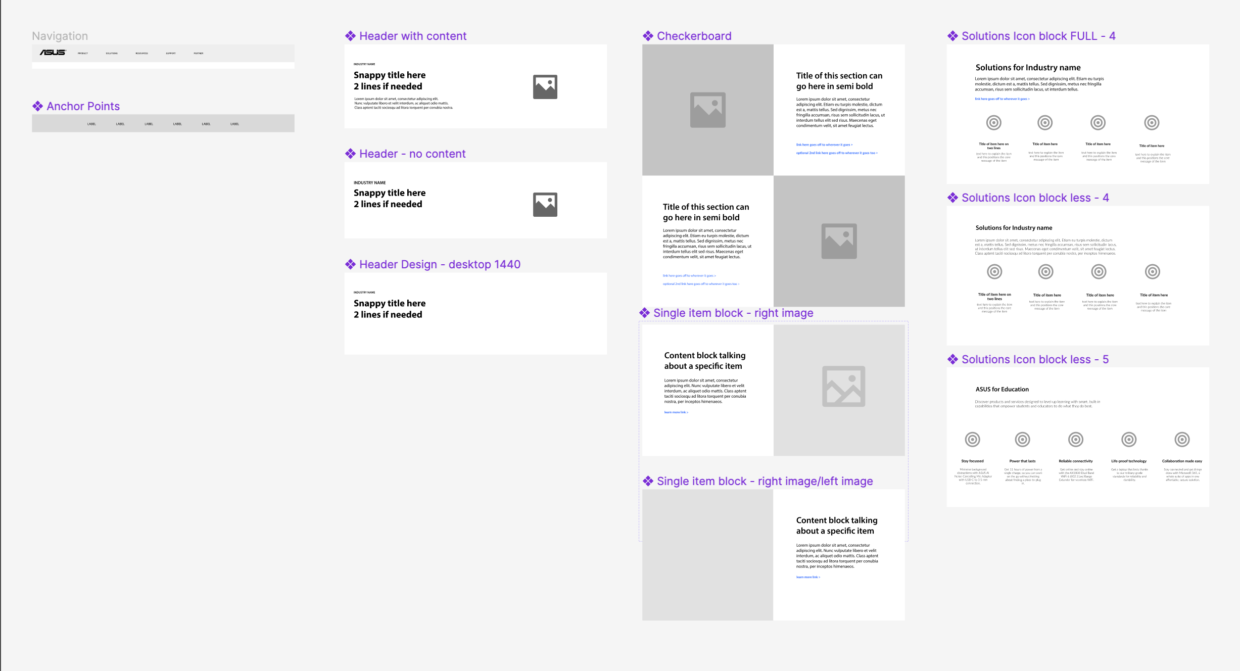
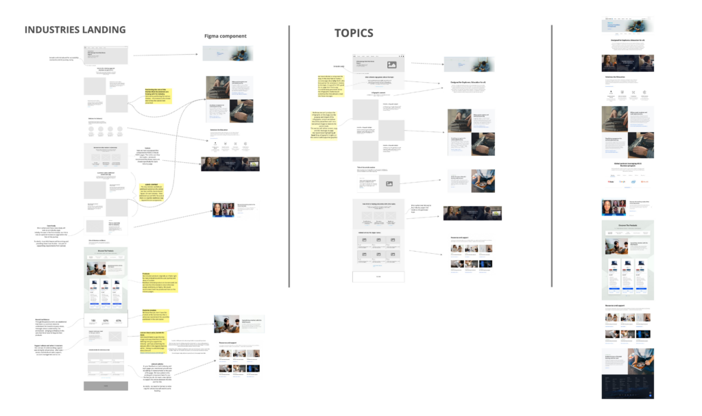
Once the wireframe component library was designed in Figma I worked on a set of initial wires for a Industry page and a Topic page wireframe – the two core pages we were working with.
Once I was happy with the flow and wireframes, I pulled them into Miro and ran a workshop with our content, strategy and design team.
I encouraged the use of MIRO alongside Figma at Earnest to open up the collaborative communication across the team for those who Figma was a little too complex.
MIRO is a great tool for ideas, concepts, workshops and even sketching fast prototype ideas.
We made some changes in the workshop and presented ideas to ASUS who of course, also had some tweaks they wanted.
It was here where I pushed home the importance of the two new components that I felt we needed – they took the ideas away and came back with some push back, but eventually saw that the overall user journey would benefit more by creating these components as it allowed the content to differentiate itself.
What was the issue?
The issue was that there were too many pieces of content that were being forced to use the same content component as their component library only had a couple of variations with an image in use.
The law of common region states that “the human eye tends to perceive similar elements in a design as a complete picture, shape, or group, even if those elements are separated“. Therefore – separating these elements with a different UI would be a better overall experience and allow users to visually see the difference when scanning the page content.
TINY USER JOURNEYS…
ASUS has no plan for user journey through the site – only that the user would navigate between industry landing pages and topics. There was no intention to connect users to other parts of the site, or indeed back into the business page if they left that part of the site.
I presented a series of scenarios and ‘what if’s’ – some i’ve listed below – where I suggested spending time defining these and ensuring that there were no gaps or dead ends for users. Sadly, like the user testing, this was also not something ASUS wanted to take up.
- When a user clicks ‘more information’ on any of the products that you have in business at the moment, you are redirecting them over to the consumer site – can we fix this journey so that more context and journey stays on the business site?
- How can we track the journey through to conversion when there are no forms?
- Can we look at building in links, history trails and CTA banners on other parts of the site, if the user gets sent to the consumer side as they currently can’t get back easily?
WIREFRAME > DESIGN
Working closely with the creative design team at Earnest who were defining brand styles for the campaign and the landing page graphic style I helped to direct this from a consistency perspective, ensuring that graphics didn’t wash out or override UI elements such as breadcrumbs, navigational aids or buttons and that CTA styles were designed slightly differently to all other image styles.
Image sourcing took quite some time, and we ended up doing a film and photoshoot for ASUS in France. We also hadn’t yet got final approval on the graphic device that would be used.
As we had a version of the copy already defined, we started with an initial design with some imagery dropped in and the real copy to ensure that this sat well in the flow of the page, before layering up the full design with full images and graphic styles later on.
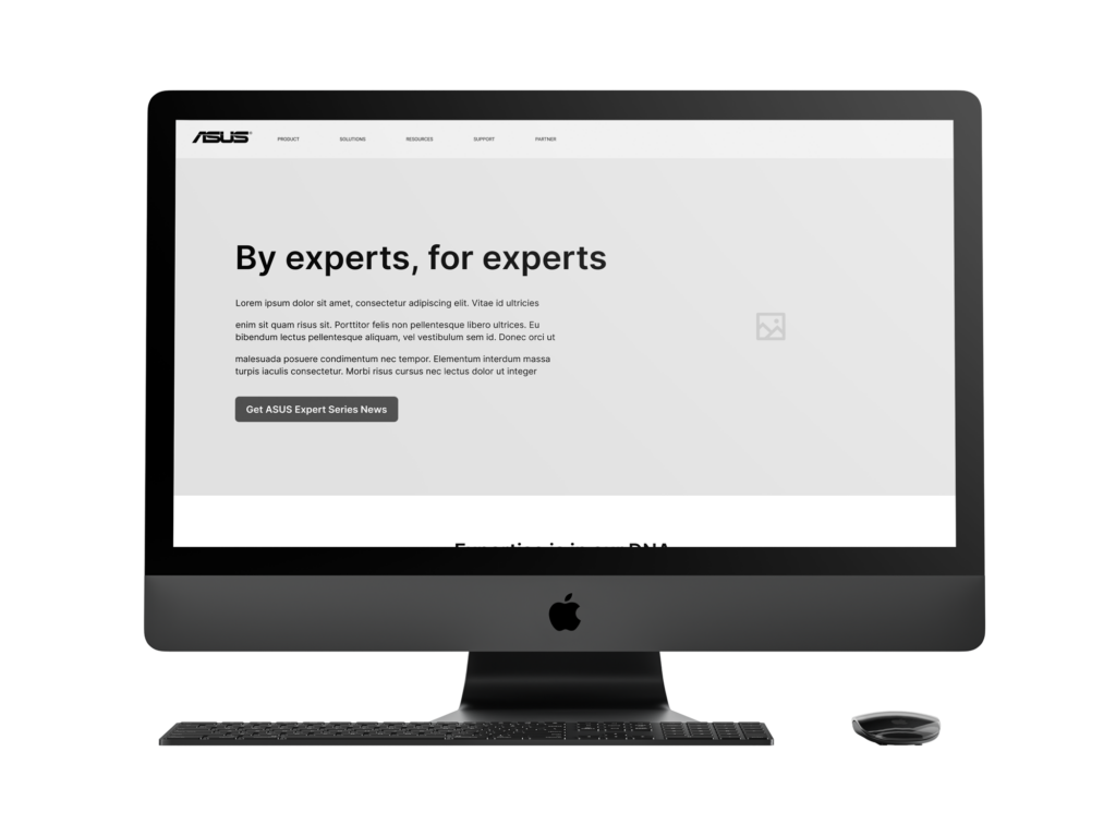
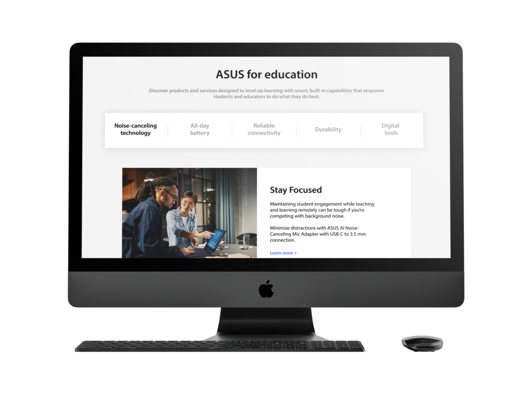

The landing pages went through a series of design tweaks and changes in the development process (ASUS delivered this themselves) but the final product you can see at the ASUS for Business website. The Education page as an example here